Here is the third installment of results for the 1st Michigan Beer Label Competition, brought to you by Beer Avatar. This post reports the results for the 6 breweries that were ranked 18th out of the 36 breweries in the competition.
Michigan Brewing Company. Score: 20; Rank: 18 out of 36.
Six breweries tied for 18th place in the competition with a
score of 20. One of these was the
Michigan Brewing Company from Webberville that went out of business this past
year. This brewery contract-brewed many
beers over the years, including an early version of Frog Island beer and Kid
Rock’s forgettable Bad Ass beer. I only judged the 7 labels that this brewery put
their own name on.


I really liked the
fact that the brewery used famous Michigan scenery for several of their labels,
particularly the Peninsula Porter and the Mackenac Pale Ale. These labels are
fairly simple in design but they are pleasing to the eye. The brewery also had some decent artwork for
their Celis brand beers that the brewery purchased in the early 2000s. I
believe that the labels changed very little from the time is was brewed in
Austin, Texas. The Celis brand of beer
sure has changed hands a number of times as can be read about here: http://www.celisbrew.com/home. (Now that the Michigan Brewing
Company’s equipment and brands have been sold to pay creditors, the
Celis brand will continue is journey.)
The information content on the labels is pretty poor.
Schmohz Brewery, Score 20; Rank 18 out of 36.
The Schmohz Brewery, from Grand Rapids, has only had fairly
wide distribution of their bottled beer for a few years. I really liked the fact that at one time they
sold a combination 6-pack where you could try 6 different beers.
The labels use a comic-book-art approach, which gives them good connection/branding among the labels but also
for some labels a slight impression of adolescence. I think the brewery, in a tongue-in-cheek
fashion, play up young (ok, any age) male infatuation with breasts, as
evidenced by the obvious cleavage in many of the labels and the beer names,
with Treasure Chest ESB, Amber Tease Ale, Hopknocker Imperial IPA, and Bra
Buster Bock chief among them.


They have wonderful variety among their labels and the creativity is
certainly there. The labels have good
information content, including the ABV% and a brief statement about the beer.
Warning: The statement about Treasure Chest has the words “mesmerizing” and
“caressed” in it. Wink, wink!
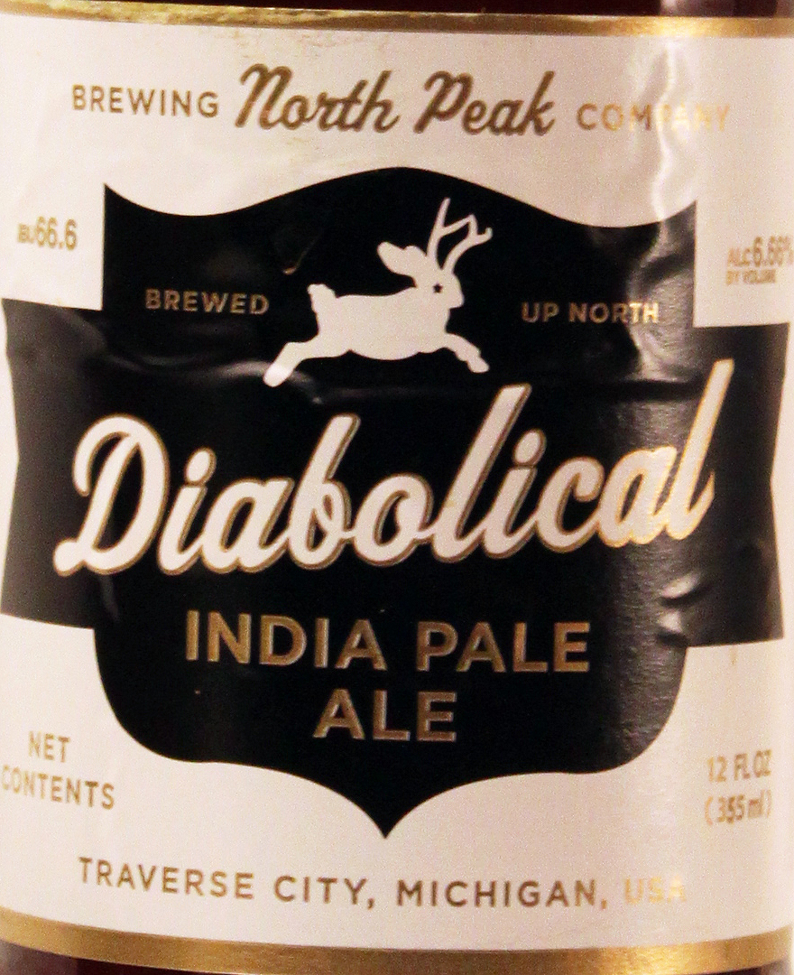
North Peak Brewing Company.
Score 20; Rank 18 out of 36.
Traverse City’s North Peak Brewing Company also tied for 18th
best beer labels in Michigan. This
brewery makes excellent beers as would be expected from Ron Jeffries (Jolly
Pumpkin Artisan Ales). I also like the
stylistic labels and the squat bottles.
The labels all have the same design with occasional subtle changes that
really add to the appeal. The design is
quasi-chevron field, with the beer name in script across the middle, the beer
style written across the bottom, other text around the field, and a stylized,
silhouette creature at the top. The
creatures are visual interpretations of the beer name.

Motor City Brewing Works. Score 20; Rank 18 out of 36.
Motor City Brewing Works has been a mainstay of the Detroit brewing
scene for more than a decade. They
embrace the city and their role in its history.
They also make some great beer. Did
anybody else get a toolbox of Motor City beers for Christmas?
The labels generally embrace the auto
industry/blue collar theme, with gears on some labels and bolts and wrenches on
others. The basic idea is creative, but
tends to get overused among the various labels.


The labels contain a brief description of the beer and the lack of pasteurization
and filtering. Alcohol levels are also
included.

The label for their Honey Porter is quite interesting but I have no
idea what it is about. The artwork depicts three penguins standing in building
with what look like Tuscan columns. The building is shown as opening to a winter
landscape. How all this related to an
unnamed honey porter must be a brewery secret. Any ideas/?
Tri-City Brewing Company.
Score 20; Rank 18 out of 36.
Tri-City Brewing Company in Bay City was one of the 6 breweries that
tied for 18th place in the beer label competition. Although this brewery has been in operation
since 2007, I only came across their bottled beer a few years ago. I was excited to try beers that had been
brewed in this part of the state. I
think they make excellent brews and I simply must make a trip to the tap room
sometime soon. The brewery has at least
9 labels that are all very distinct. The
artwork for many of the labels is pretty basic, such as the label for
Brownhoist Nut Brown Ale.

The brewery
does a have a couple of labels that are creative and pleasing. Included in that list are Giant Slayer Russian
Imperial Stout and Fortunato Belgian-Style Trappist Ale. I like the intentional medieval feels to
these labels. I wonder, however, what
the Trappist breweries of Belgium, Netherlands, and Germany think about the
brewery calling its beer “Trappist.”? I
doubt the monks ever get to Michigan.


Mt. Pleasant Brewing
Company. Score 20; Rank 18 out of 36.
The Mount Pleasant Brewing Company, hailing from the city for which
they get their name, also tied for 18th place in the beer label
competition. This brewery makes a wide
variety of beers ranging from a red ale, to a double IPA, to a pale ale spiced
with herbs. They have labels for about
14 of their beers. Nearly all of the
labels follow a railroad theme. The
majority of the labels follow the same basic graphic design of a train engine
with a snow-capped mountain in the background, the beer name written at the bottom,
and the brewery logo at the top. Not all
that artistic or creative. There are some subtle details that change for certain
beers. A good example is the horse head
on the train engine for their Iron Horse IPA.


Most of the labels
are two-colors and not that stunning. More
recent labels, such as Freight Train Double IPA are much more artistic,
detailed, and interesting. It also doesn’t
hurt that this is an excellent DIPA.
Look toward Beer Avatar forfurther results of the Michigan Beer Label Competition.
Cheers,
Zymus
No comments:
Post a Comment